
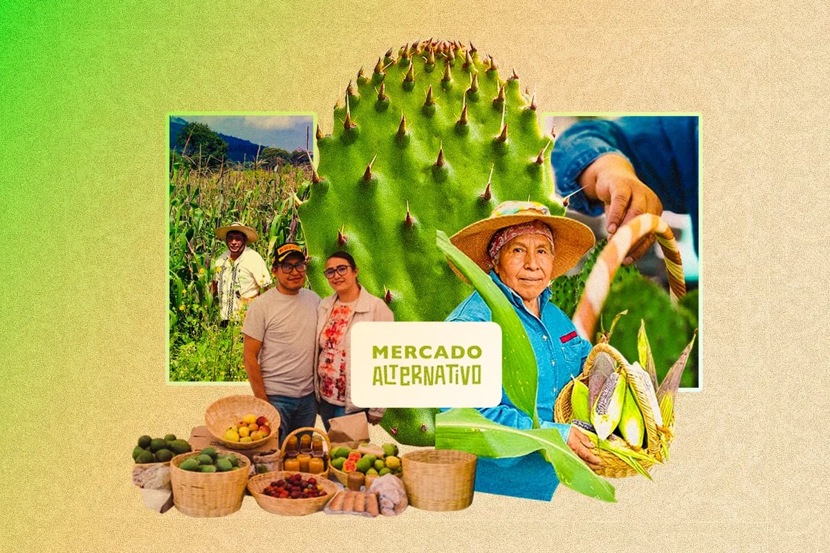
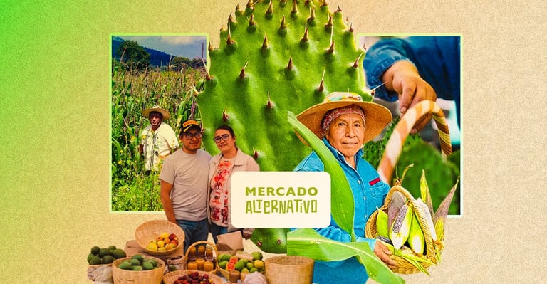
🥑Alternative Market Mexico City App: From Research to Design
A Digital Gap That Fractures the User Experience
🌱 Overview
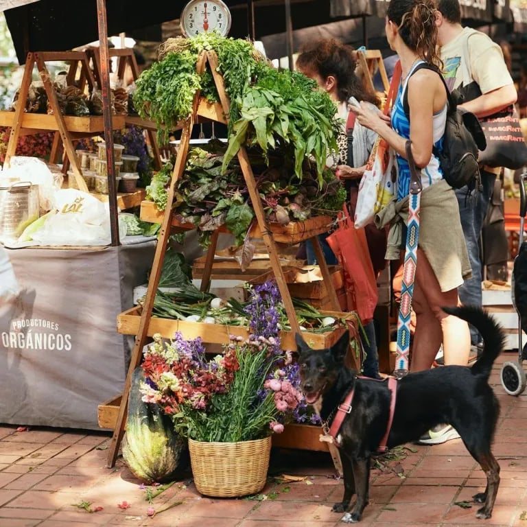
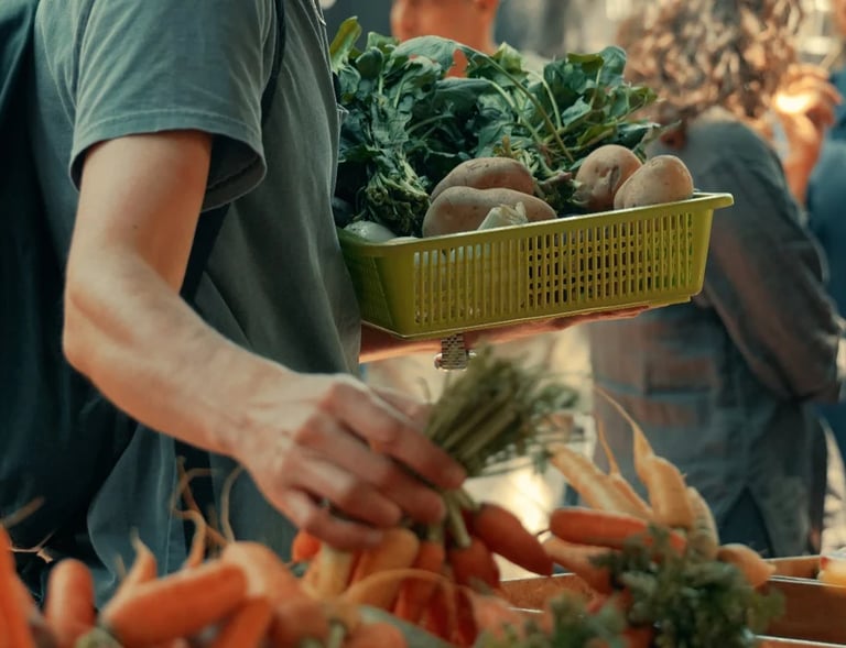
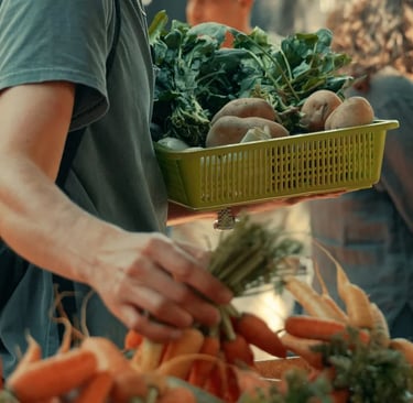
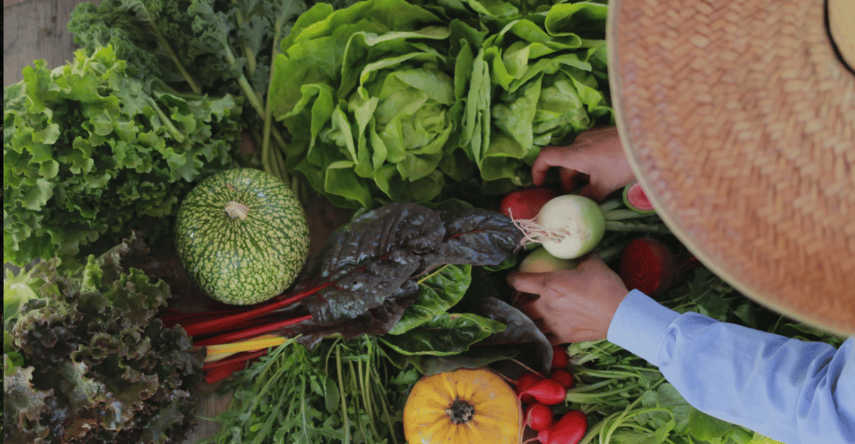
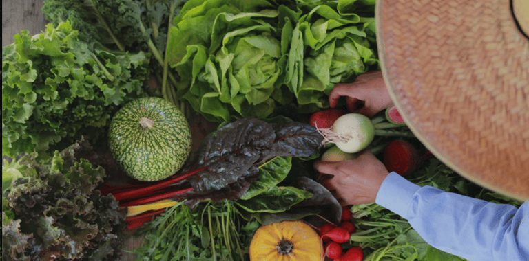
Mercado Alternativo is a fair-trade marketplace connecting 100+ agroecological producers with conscious consumers in Mexico City.
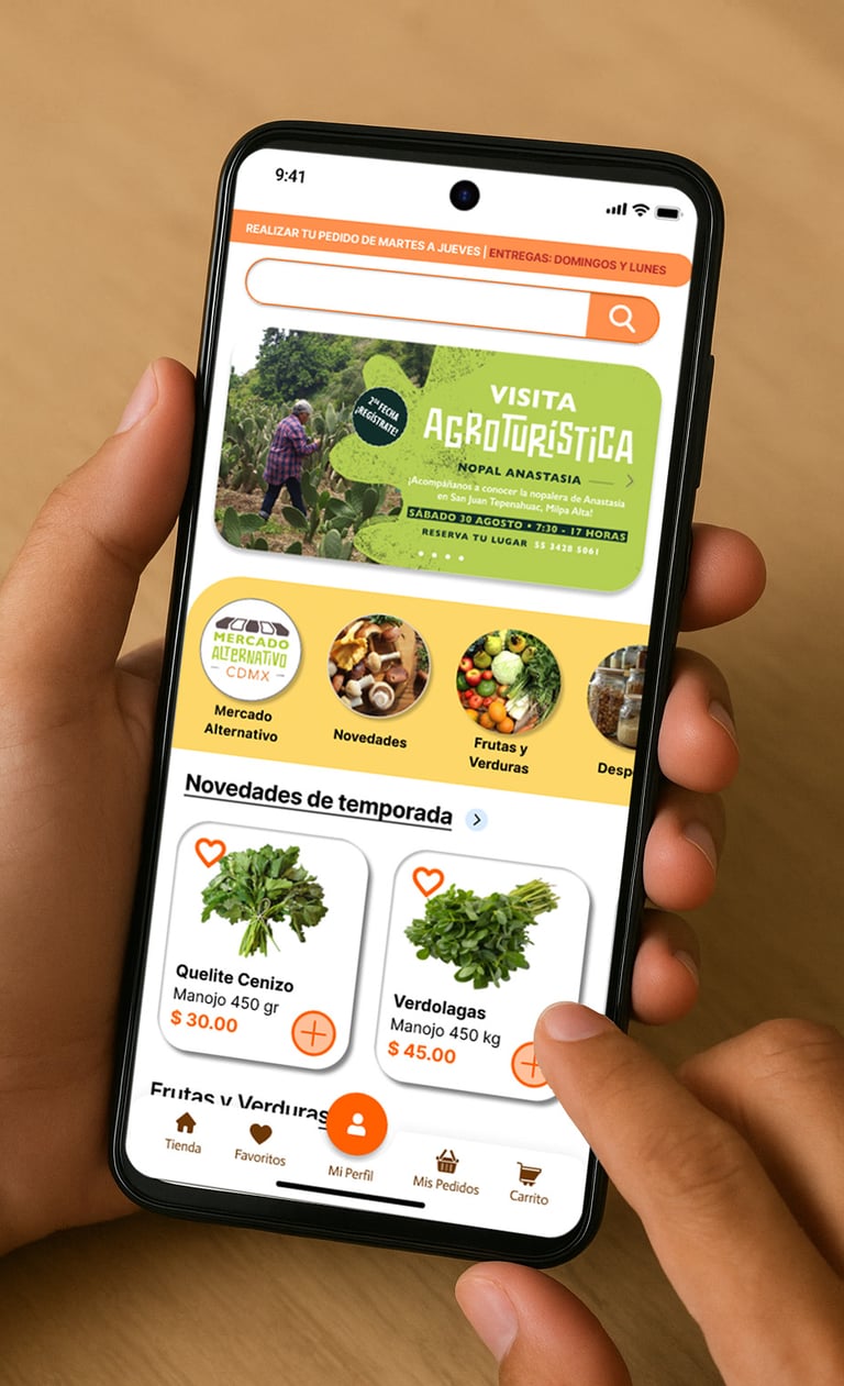
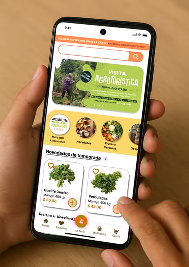
The web platform, unchanged since 2020, faced critical friction: chaotic navigation (6-level deep menus), no repurchase functionality for recurring users, and fragmented checkout forcing users to leave the platform.
Our Impact
Through rigorous research, I identified 3 core problems affecting 100% of users and designed validated solutions via iterative testing.
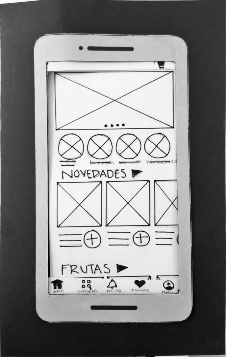
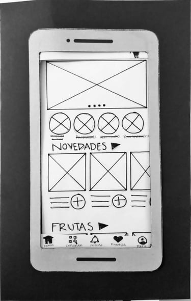
I redesigned the complete experience with a mobile-first prototype (30+ screens) achieving:
Research insights continue guiding current site improvements. Implemented quick-wins generated positive feedback validated by users.
⏱ 35% REDUCTION IN PURCHASE TIME (3:24→2:13)
📊 85.0 SUS SCORE
✅ 100% OF USERS COMPLETED THE TASK WITHOUT ASSISTANCE
Business Impact
Although the mobile app was not launched due to budgetary constraints, the research generated lasting value:
🌶️Built organizational capacity: Stakeholders now independently make data-driven UX decisions.
🌽 Implemented quick wins: Navigation and categorization improvements led to a measurable increase in user satisfaction.
🥑 Delivered a ready prototype: A high-fidelity prototype is available for future implementation when resources allow.
Role
Lead UX Researcher & Product Designer
Organizational Educator
Timeline
4-months
June-Sep 2025
Tools
Figma/FigJam
Miro / Wimsikal
Google Meet
Assembly(AI transcription)
Google Workspace
Process
From Frustrated User to Researcher
As a loyal weekly user, I experienced recurring friction but needed validation: was this my perception or a systematic problem?
I identified 3 critical friction points:
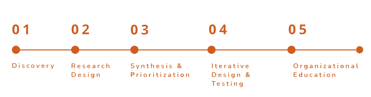
01.Discovery
01
🗺️ Chaotic Navigation
6-level deep menus, minutes spent finding basic products
02
🔁 No Repurchase Function
15+ minutes weekly searching for the same recurring products
03
💳 Fragmented Checkout
Bank transfer → screenshot → WhatsApp (manual process outside platform)
Designed mixed-method protocol combining qualitative depth with quantitative validation.
02. Research Design 🔍
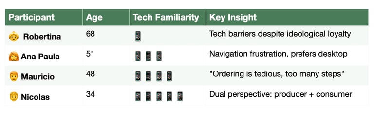
🧏♀️Conducted 5 contextual interviews (60 min each) with users aged 34-68, diverse digital literacy levels.
🗣️ Think-Aloud Protocol:
Users shared screens navigating the actual site while verbalizing their mental process in real-time. This allowed me to time tasks and observe confusion pauses.
5 Thematic Blocks:
🏠 Context and general habits
🛒 Current purchase process (journey, friction, emotions)
⚠️ Needs and frustrations (pain points, workarounds)
📱 Technology and openness to change
💡 Co-designing a better experience
Key Insights:
100% buy "the same thing" weekly → repurchase is core business model
Even tech-savvy users prefer desktop (mobile experience "uncomfortable")
WhatsApp is preferred channel for communication across all ages
💬 "It's so tedious. Every week I search for EVERYTHING from scratch: vegetables, bread, dairy."
— 👩🦰Ana Paula, 51
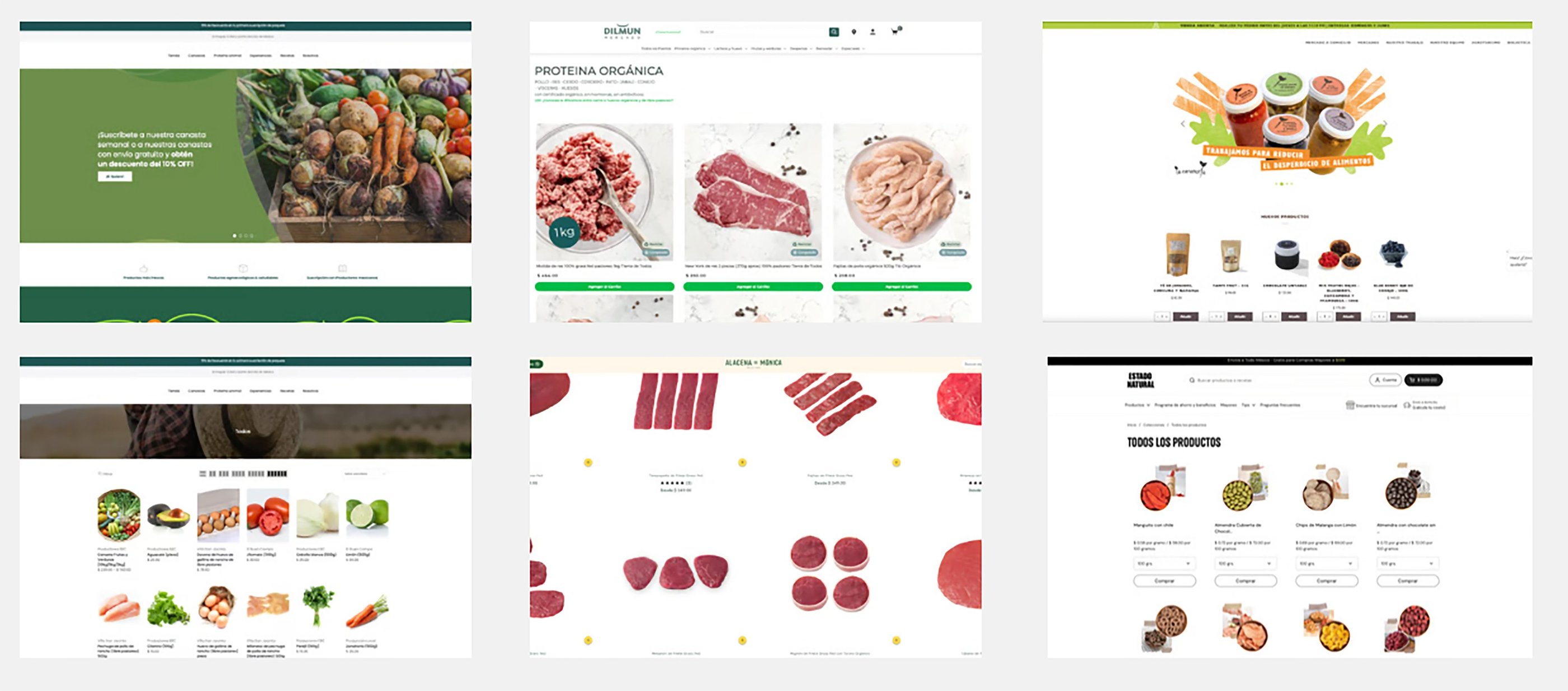
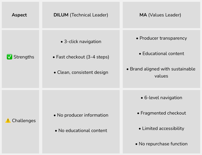
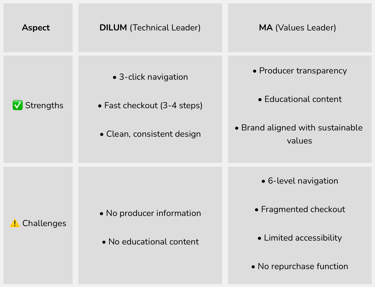
Competitive Analysis
Evaluated 5 sustainable e-commerce platforms via heuristic evaluation and cognitive walkthroughs.
Finding:
None of the platforms are mobile-first; navigation is better on PC
DILUM is the most efficient but lacks producer information and process transparency
MA offers excellent educational content but has a poorly optimized user flow
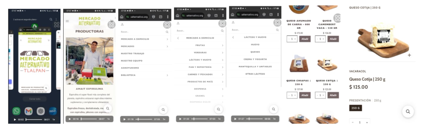

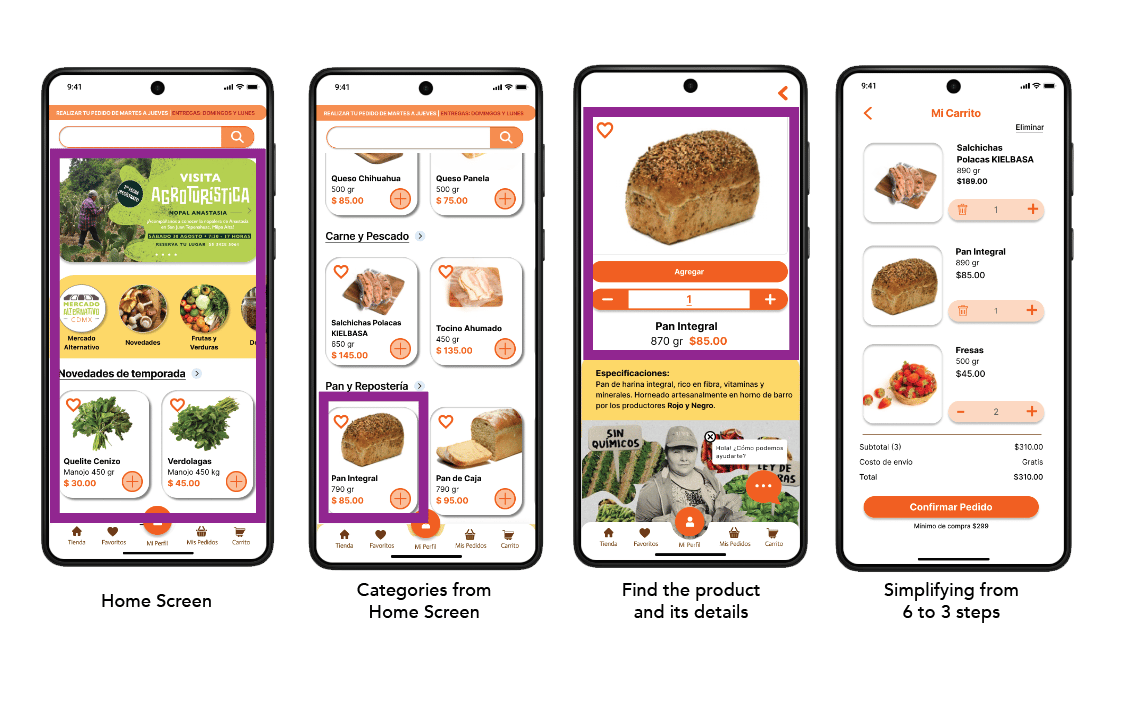
Figure 1.1: Current User Flow for Finding a Product.
This diagram illustrates the 6-level deep navigation menu a user must traverse to locate a basic product like cotija cheese.
Mobile device navigation video: https:// drive.google.com/file/d/1p6p530BNqnyWLAKyDzACkizZxFAy-rXO/ view?usp=sharing.
Map of the current purchase journey, identifying pain points, emotions, and timeframes for each process stage.

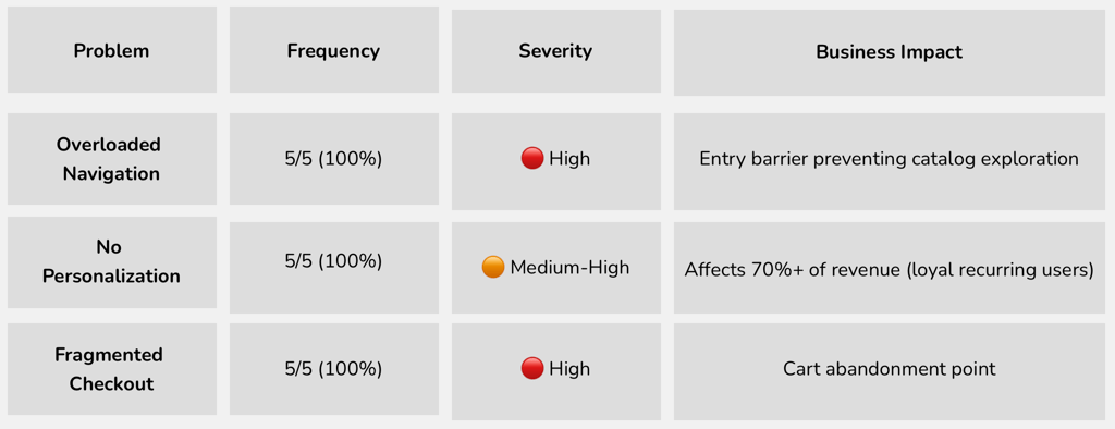
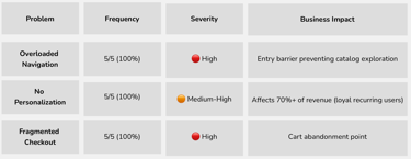
📋 3 Core Problems Identified
💬 "Almost every week I buy the same thing, but I have to search for everything from scratch. It would be much easier if there was a 'buy again' button."
— 👨🦰 Mauricio, 48
Synthesis
Synthesized 5+ hours of interview transcriptions via affinity mapping, revealing recurring patterns validated through frequency matrix.
Prioritization Criteria:
Mention frequency (3+ users = critical)
Severity of impact on experience
Stakeholder validation (Director)
From Problems to Solutions
Based on validation matrix findings (100% of users reported friction), I prioritized a mobile-first design eliminating unnecessary submenus and steps.
03. Ideation & Design 🎨

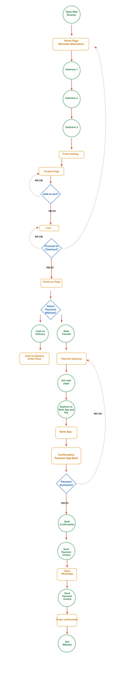
User Journey
Brief Findings Summary
Interviews revealed that users love the mission and heart 💚 behind Mercado Alternativo, but the purchasing flow feels long, confusing, and emotionally draining.
To place a single order, users must navigate multiple menus, confirm several decision points, and jump across external apps for payment and confirmation.
This fragmented journey increases frustration, adds cognitive load, and often leads to abandoned orders—even among users who genuinely care about supporting the project.
Critical Validation:
These 3 problems are NOT individual perceptions—100% of users experience friction in navigation, personalization, and checkout.
This confirms they are systematic usability problems, not digital literacy issues.


User Stories
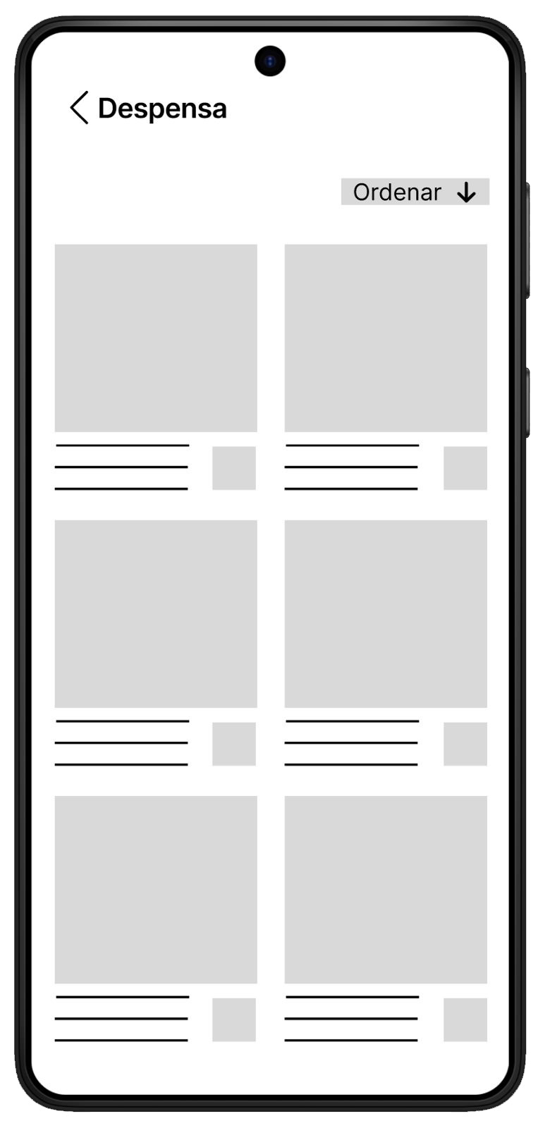
Story 1: As a new user, I want to easily find products without getting lost in menus to complete my purchase without frustration.
→ Solution: Simplified mobile-first architecture with maximum 3 levels
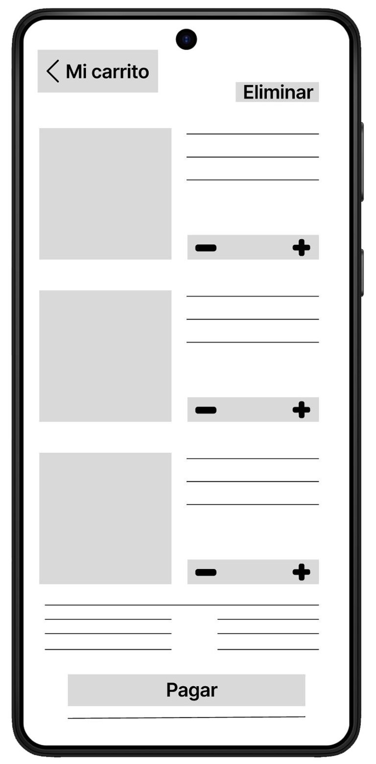
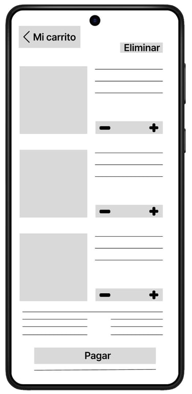
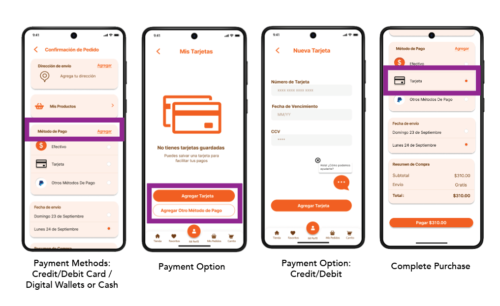
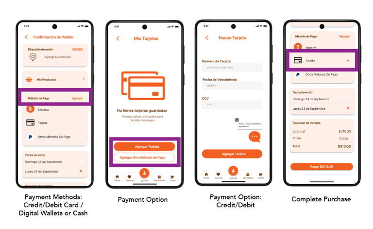
Story 2: As a user of any age, I want to complete checkout without leaving the app to avoid unnecessary steps.
→ Solution: Integrated checkout with multiple payment methods (PayPal, card, SPEI)

Conducted 2 cycles of iterative testing:
Cycle 1: Low-Fidelity (August 2025)
5 users, 60 min/session
Validation: 100% completed checkout without assistance
Iteration: 3/5 didn't understand icons → added labels
04. Usability Testing 🧪
💬 "The process is so slow. I fill everything out, then I have to leave the app to do the bank transfer. Sometimes I just order via WhatsApp instead."
— 👨🍳 Nicolas, 34
💬 "It's so slow to find things... I prefer using my computer because on mobile it's worse."
— 🙎♀️ Ana Paula, 51
Cycle 2: High-Fidelity (September 2025)
5 users (including colorblind user)
Validation: Consistent improvement across all profiles (ages 34-68)
Iteration: Multi-modal system (patterns + icons + color) for accessibility
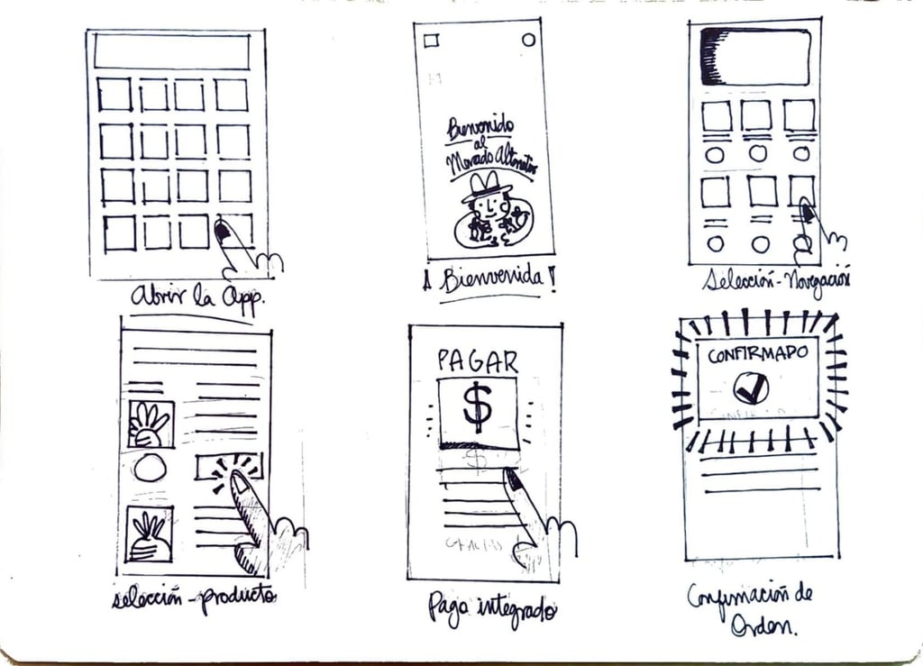
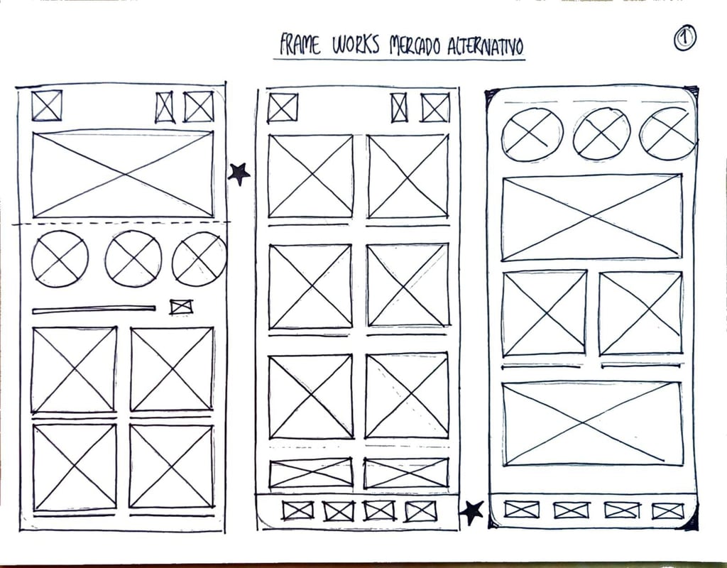
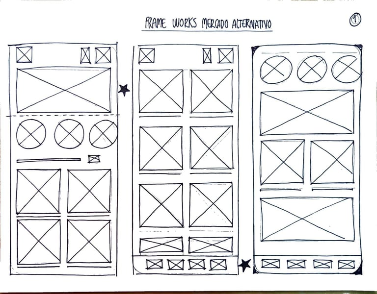
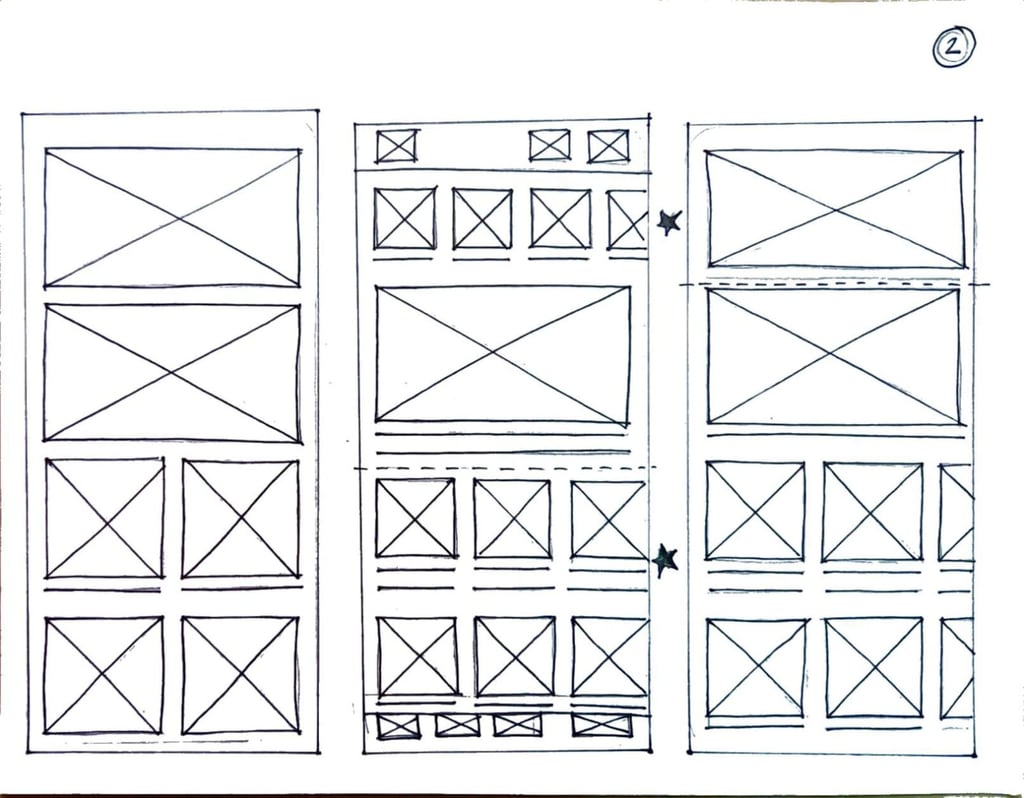
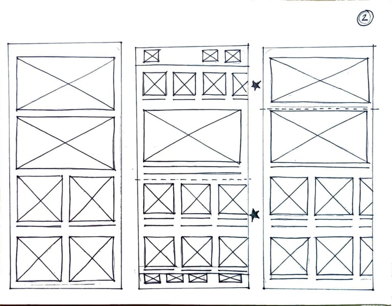
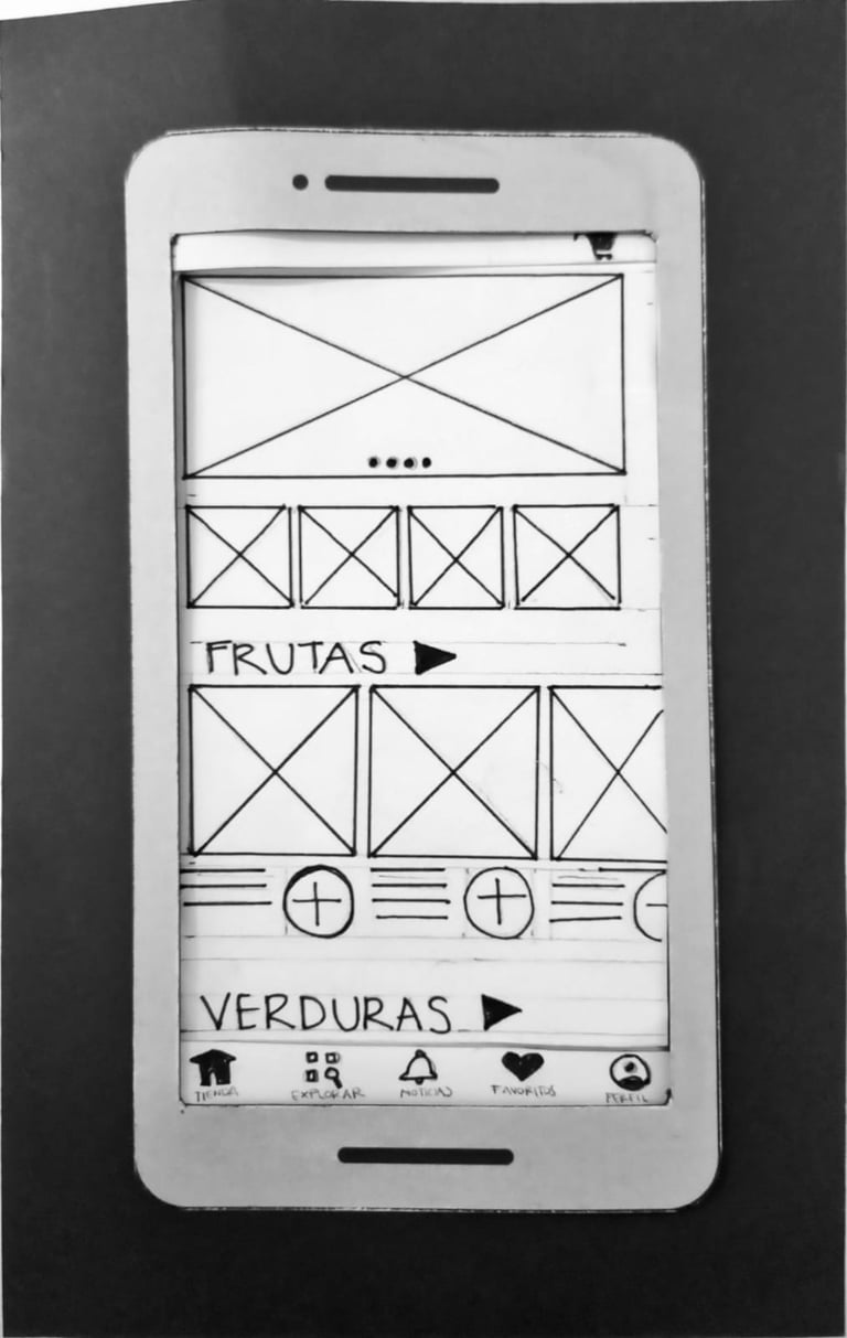
Sketching & Wireframing
Explored solutions through hand sketches → digital wireframes → interactive prototypes.
Mental Models: Referenced apps users already know (Rappi, Justo) to reduce learning curve.
📊 Results
Quantitative Impact
Comparative analysis of current website vs. high-fidelity prototype across key usability metrics, demonstrating measurable improvements in efficiency and user experience.
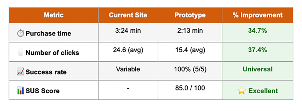


📈 Key findings:
• 34.7% reduction in average purchase time
• 37.4% reduction in required clicks (from 24.6 to 15.4 clicks)
• Consistent improvement across all user profiles (30-44% optimization)
• Greatest impact on users with low tech familiarity (44.2% improvement for Lourdes)
Presented research insights to Director (Arturo Vera) in a 90-minute session, translating technical UX findings into actionable business language and strategic implications.
3 Key Educational Moments:
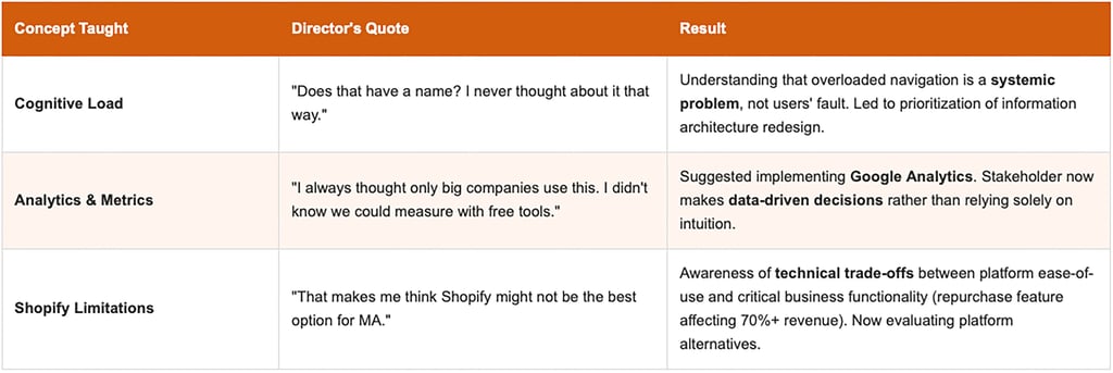
🏆 Lasting Impact:
Organizational education multiplied the value of research. The Director not only received recommendations—he now understands the "why" behind each UX decision. This allows him to make informed decisions in the future, permanently elevating MA's internal capacity.
Implemented Quick-Wins: Incremental improvements in categorization and visual hierarchy. Director reported positive client feedback: "the site feels easier to use now."
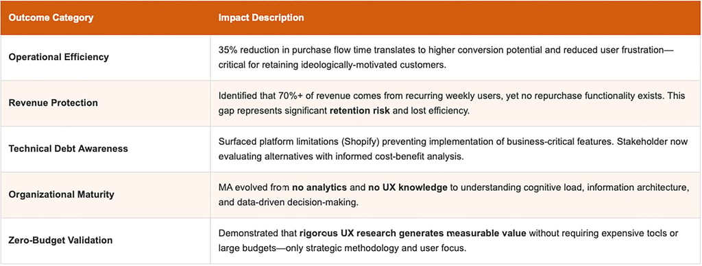
Strategic Business Outcomes
🎯 Reflection
👈 Looking Back
In a 4-month research with zero budget,
I conducted 5 contextual interviews + 10 usability tests with users aged 34-68
I produced 30+ interactive screens from sketches to high-fidelity prototype
I analyzed 5 competitor platforms with comprehensive evaluation
I synthesized 5+ hours of transcriptions via affinity mapping
I educated 1 stakeholder on UX fundamentals (cognitive load, analytics, IA)
I achieved 35% time reduction and 85.0 SUS score
I truly appreciate the opportunity to transform my Google UX Research Certification from a typical fictional case into real-world impact. While the mobile app wasn't launched due to budget constraints, this challenge demonstrated that rigorous research generates lasting value independent of development. The implemented quick-wins and organizational education created a foundation for data-driven decisions long after project completion.
👉 Looking Forward
I'd love to measure continued success by:
Tracking conversion improvements after implementing quick-wins via Google Analytics
Conducting follow-up interviews to validate that changes address pain points
Monitoring repurchase adoption if MA launches the app feature
Measuring retention rates of recurring users (70%+ revenue core)
Additionally, strategic opportunities as MA evolves:
Platform migration: Evaluating Shopify alternatives supporting business-critical features
WhatsApp automation: Integrating delivery tracking via users' preferred channel
Enhanced storytelling: Building on transparency that differentiates MA from competitors
I would love to see this project come full circle—demonstrating that ethical commerce can combine efficiency with human values to create fast, meaningful, and sustainable experiences.
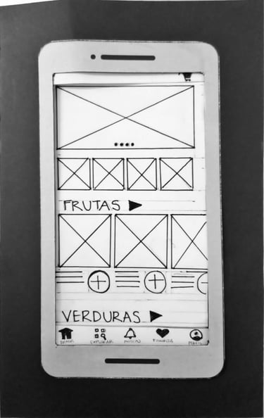
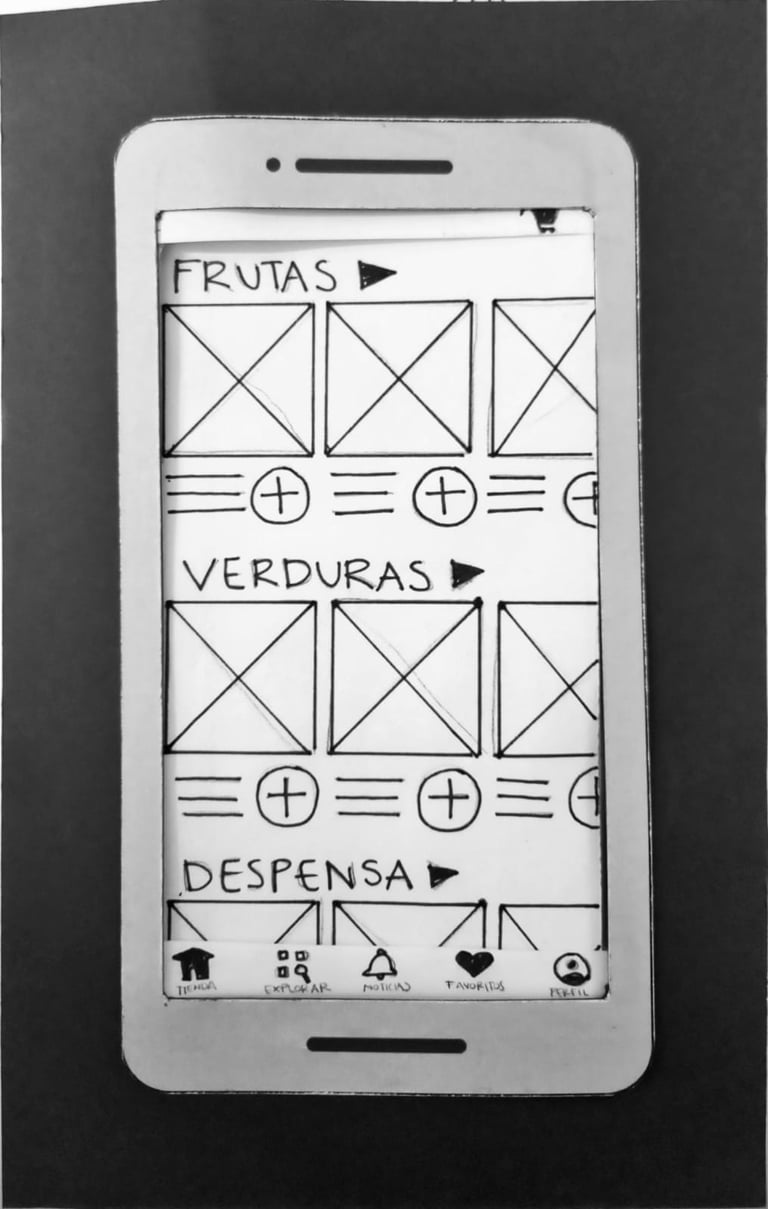
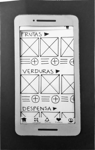
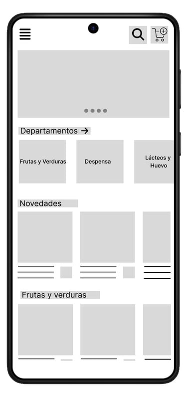
Design priority 01 / Inefficient Information Architecture
✅ The main navigation was redesigned
✅ Implement an accessible menu for all departments from the HOME page.
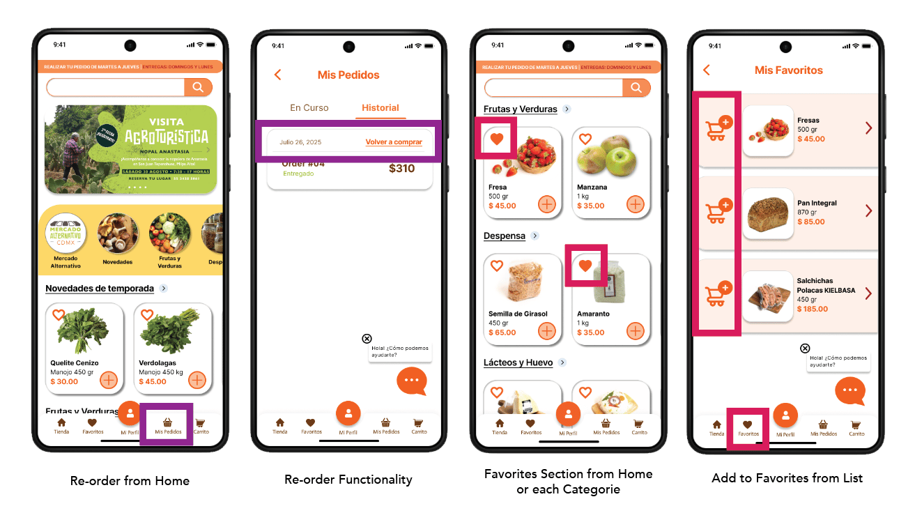
Story 3: As a recurring user, I want to quickly repurchase my frequent products to save time each week.
→ Solution: "Buy again" section accessible from home
Priority 02 / Payment Method Limitations
✅ Additional digital payment options were integrated
✅ Automated payment validation with automatic transfer confirmation (no WhatsApp needed).
Digital receipt integrated into the app.
📦 Deliverables
High-fidelity interactive prototype: 30+ screens in Figma with complete flows
Design system foundation: Reusable components, accessibility-validated palette
Research documentation: Personas, journey maps, competitive audit, affinity diagrams
Quick-wins implemented: Validated site improvements with positive user feedback

Design priority 03 / Lack of Reordering Flow
✅ An Order History section with 1-click was added "Reorder" button
✅ Favorites system - Heart icon to mark frequently purchased products.
Bottom navigation with main categories (thumb zone optimization)
Direct access to catalog from home (6 → 3 levels reduction)
"Buy again" function + favorites list
Simplified checkout from 6 → 4 steps
Inclusive design validated with colorblind user and older adults
Key Design Decisions
🛠️ Methodologies
Design Thinking • Contextual Interviews • Think-Aloud Protocol • Task-Based Usability Testing • System Usability Scale (SUS) • Competitive Analysis • Heuristic Evaluation • Affinity Mapping • Mobile-First Design • Information Architecture • Inclusive Design
Key Business Outcomes:
35% efficiency improvement in core user flow
Identification of technical platform limitations (Shopify) affecting 70%+ revenue stream
Organizational capacity building enabling data-driven decision-making
Cost-effective validation (zero budget) proving ROI of UX investment
🙌 Social Impact:
Supporting fair-trade platforms strengthens ethical supply chains, ensuring dignified income for small-scale producers in a country where criminal intermediaries extract 10-20% of food costs.
Project completed as part of Google UX Research Certification
Scaled from typical fictional case to real-world impact
June–September 2025
🌟 Strategic Summary
UX as Organizational Transformation Lever:
This case demonstrates how rigorous UX research can become a driver of organizational transformation, improving operational efficiency, user experience, and strategic positioning without requiring additional investment.
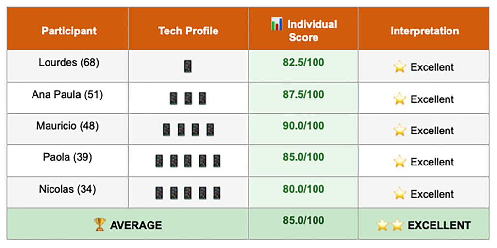
System Usability Scale (SUS)
SUS scores by participant, showing prototype achieved average score of 85.0/100 (Excellent), even for users with low tech familiarity
05.Organizational Education 🧩
Stakeholder Testimonial
💼 "Although the application wasn't ultimately launched, the design process and competitive audit generated extremely valuable learnings for Mercado Alternativo. The research, in particular, was very revealing, as it allowed us to identify critical user needs. These findings are guiding us to take precise actions aimed at improving our website."
— Arturo Vera Tenorio, Director
📧 arturoveratenorio@gmail.com (available for verification)
📝 Methodological note:
I administered the System Usability Scale (SUS), a standardized 10-question questionnaire with 1-5 Likert scale, immediately after each participant completed high-fidelity testing tasks. Each user verbally answered the 10 questions about their experience with the prototype.
🌟 Universal improvement:
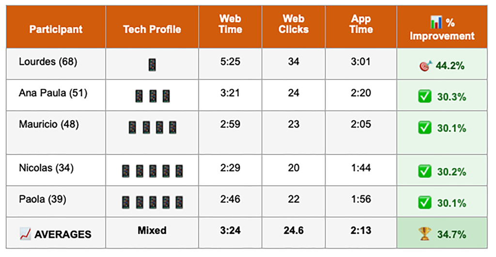
The prototype improved experience for ALL users (34-68 years, low/medium/high tech familiarity), including the most vulnerable user (Lourdes, 68 years, low digital literacy) who achieved 44.3% time improvement and gave SUS score of 82.5 (Excellent).
With an average score of 85.0, the prototype ranks among the highest-rated digital products. This validates that the designed solutions not only solve problems—they create a world-class quality experience.
What does our 85.0 score mean?
The System Usability Scale score of 85.0 indicates strong usability performance:
🎯 Exceeds the industry acceptability threshold of 70
📊 Falls within the "excellent" range (80-90) for digital products
👵 Demonstrates accessibility across user profiles—including Lourdes (68, older adult with limited tech experience) who scored 82.5
User Research and Profiles
General Profile of the Alternative Market
Our ideal user is an individual over 25 years old who lives in Mexico City, committed to responsible consumption, personal health, and supporting local producer networks. They could be people who work from home, are caregivers, or have full-time jobs that make it difficult for them to attend a physical market.
💚 They Value: Fresh, agroecological, and ethically sourced food.
⚠️ They Face: Technological barriers, lack of time, difficulties in coordinating orders.
📱 They Use: Their smartphones frequently to get information, shop, and communicate.
🔍 5 Critical Pain Points
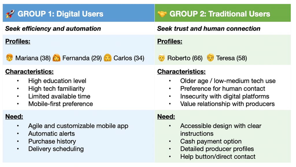
👥 Two User Groups Identified

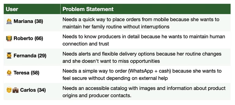
📋 Problem Statements
Format: [Who] needs [what] because [why]
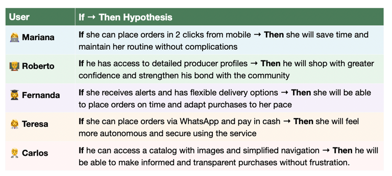
🔬 Design Hypotheses
Format: If [solution] → Then [expected outcome]
This user analysis serves as the foundation for designing solutions centered on the real needs of Mercado Alternativo.
Customer Journey Map
Mercado Alternativo Current User Experience in the Online Purchase Process
🎙️ Contextual interviews
Testing Participants
These participants tested the Low and High interactive prototype and provided quantitative metrics for improvement validation.
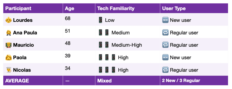
Complete User Breakdown - Usability Testing
Individual performance metrics across diverse user profiles (ages 34-68, varying tech literacy), demonstrating consistent improvement across all segments with greatest impact on users with lower tech familiarity.
Detailed comparison of complete purchase flow (search 3 products + full checkout)
01
Difficulty accessing from 📱mobil device:
No mobil Optimization creates a frustrating and inefficient shopping experience, missing key features for seamless process.
02
📅 Inflexible delivery schedule:
Fixed delivery windows do not accommodates users routines and are often communicated ambiguously, creating uncertainty.
03
🙈Lack of clarity and consistency in information:
Means that, without a purchase history or automatic reminders, users are forced to manually reconstruct their orders weekly.
04
Insecurity with electronic 💳 payments:
The absence of immediate payment confirmation and a transparent tracking system creates distrust, among users with low digital literacy.
05
💻 Technological barrier:
The lack of guidance and accesible interface excludes and frustrates older or less tech-savvy users, often leading to abandoned orders.


LET'S DO SOMETHING TOGETHER
Get in touch!
You didn't come this far to stop. The best is still ahead.